
Patreon Mobile Apps
In Q1 2019, Patreon rolled out a new pricing structure with increased fees for creators. In order to instill trust in current and prospective creators, the entire website was visually refreshed to reflect the brand of a high quality professional membership platform.
The iOS and Android apps served 1M users every month, 20-30% of whom used the apps exclusively. However, since the apps team was very small, the mobile apps were not updated with the new look and feel, and therefore no longer matched the rest of the Patreon product. As the design lead on mobile, I was tasked with taking the new design system and translating it to the mobile app space.
Our goals were to:
Simplify the navigation
Update the look and feel to create a unified product across all clients
Improve retention & decrease churn by focusing on existing recurring pledges
Build trust with creators and patrons
Improve accessibility
Bring product quality and delight
The design system refresh across desktop and mobile
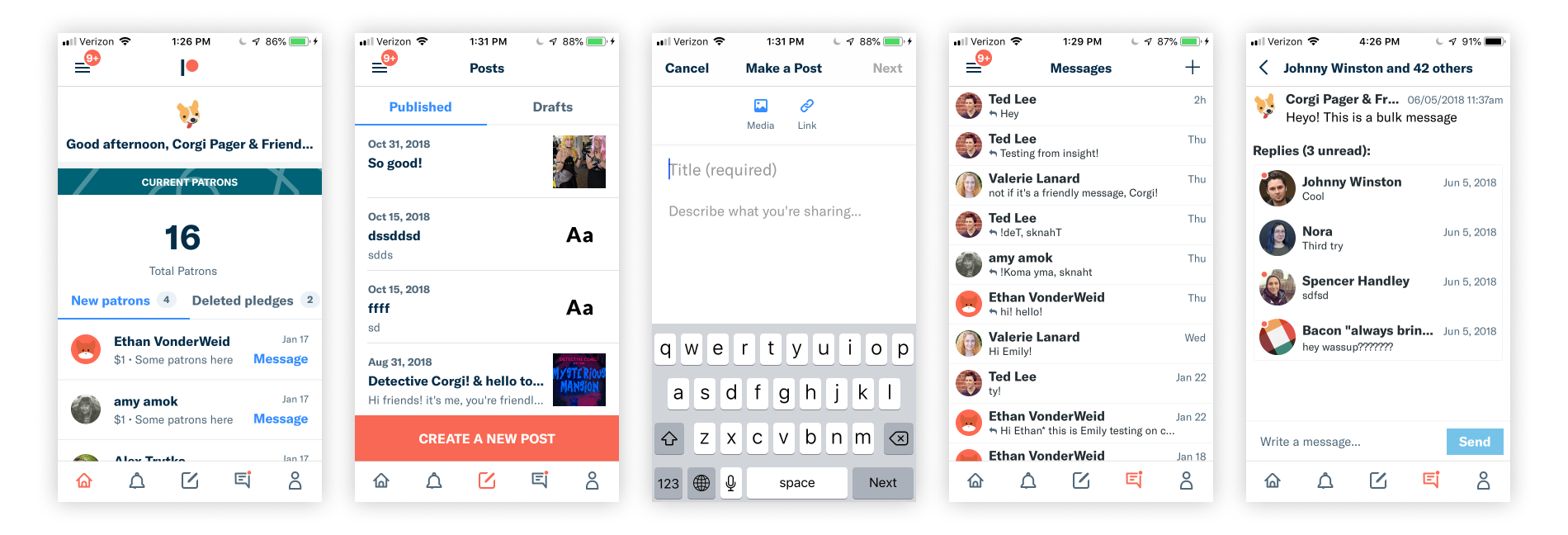
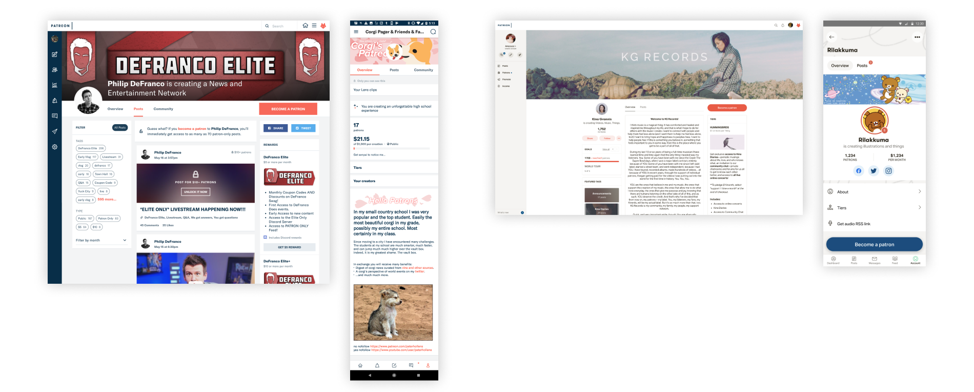
Patreon app before the redesign
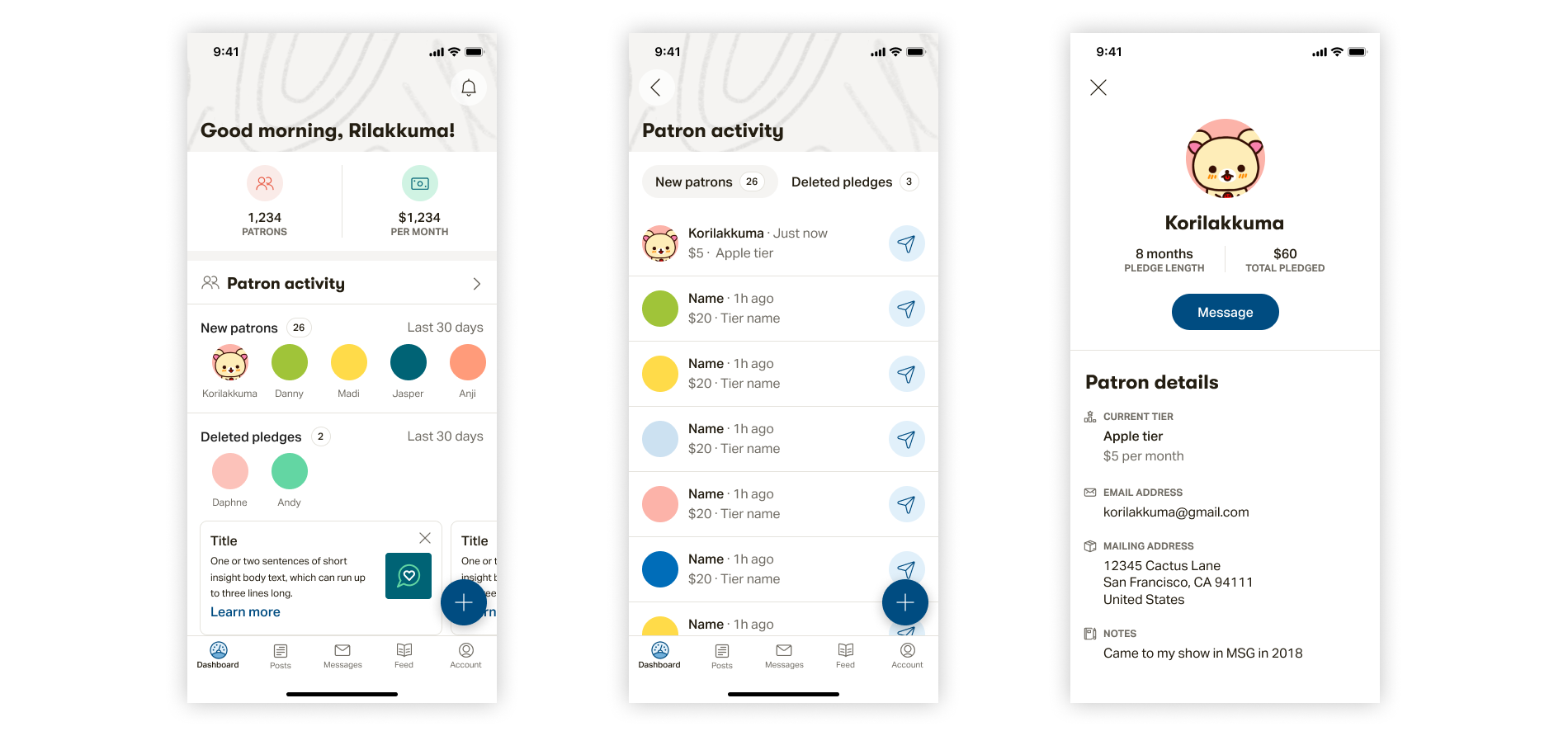
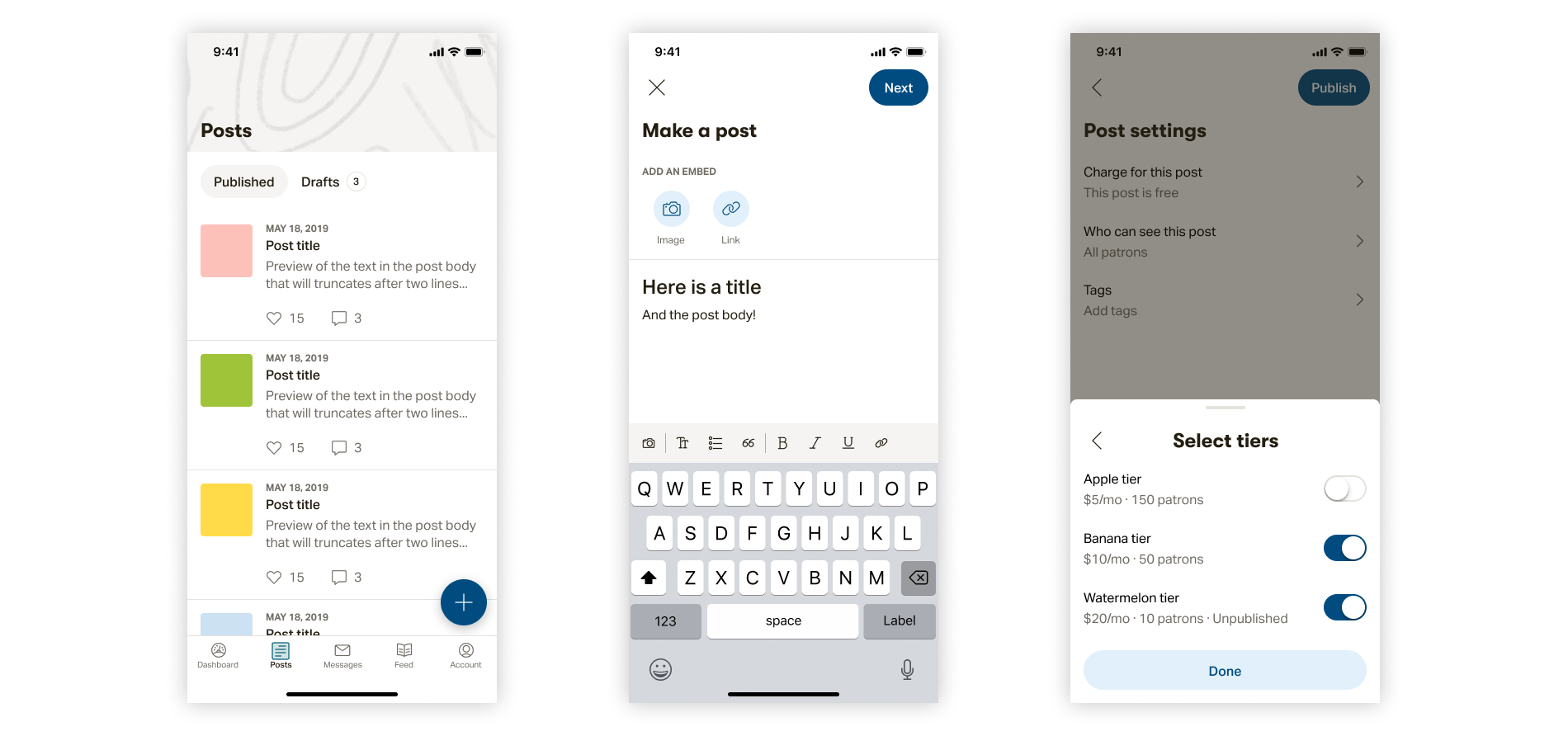
Final refreshed design
Getting started with research
I started the process by kicking off a research study with 12 creators and patrons to understand how they were using the app today, what frustrated them, and what feature gaps could be filled.I didn't want this project to just be a surface-level effort to "prettify" the app. In order to be trusted as a professional product, we had to provide a high quality experience.
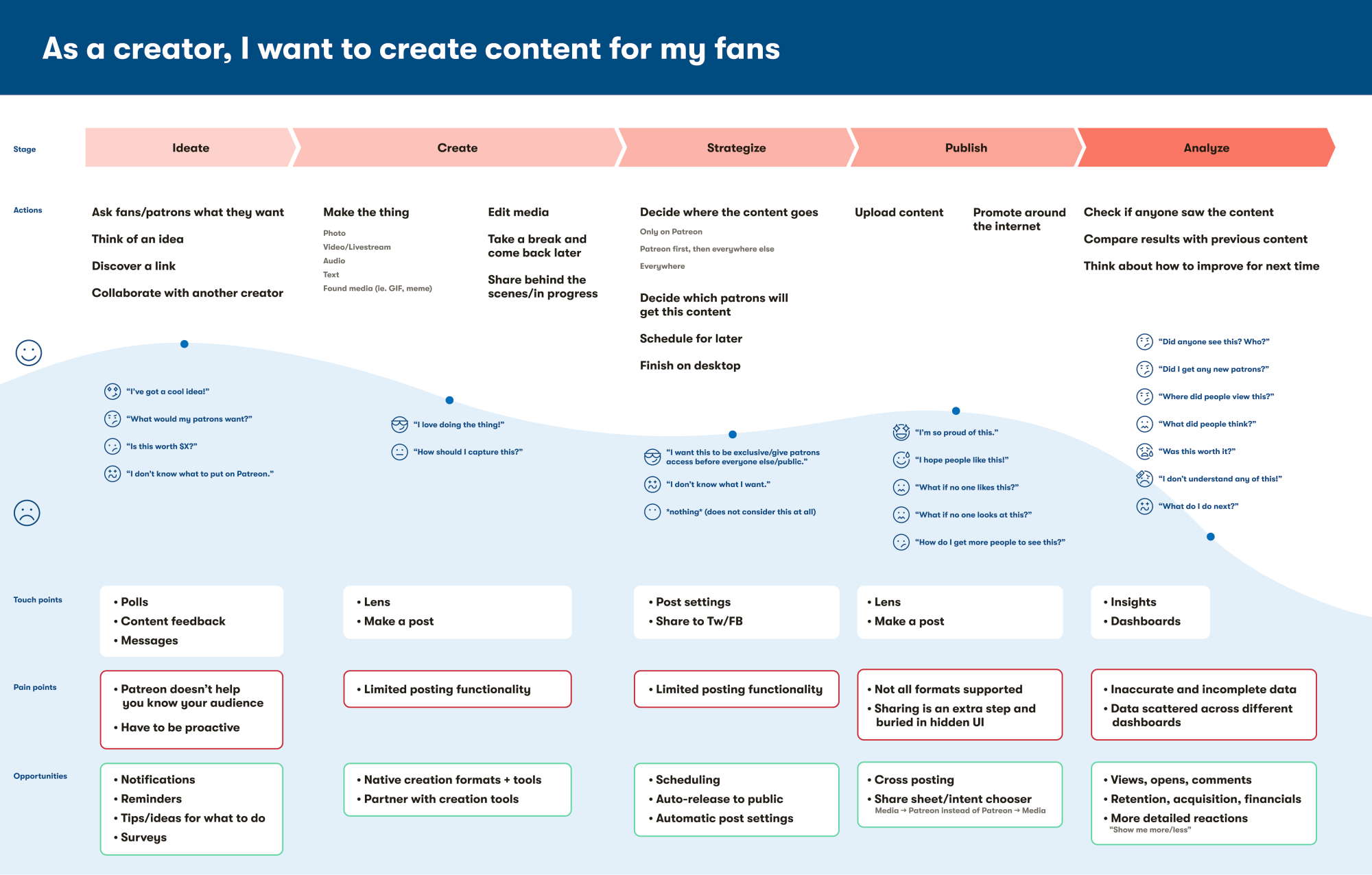
Taking the insights gathered from research interviews, I created a journey map for creators and patrons to map out the highlights, pain points, touch points, and opportunities.
Early wireframes from mapping out the core pieces of navigation
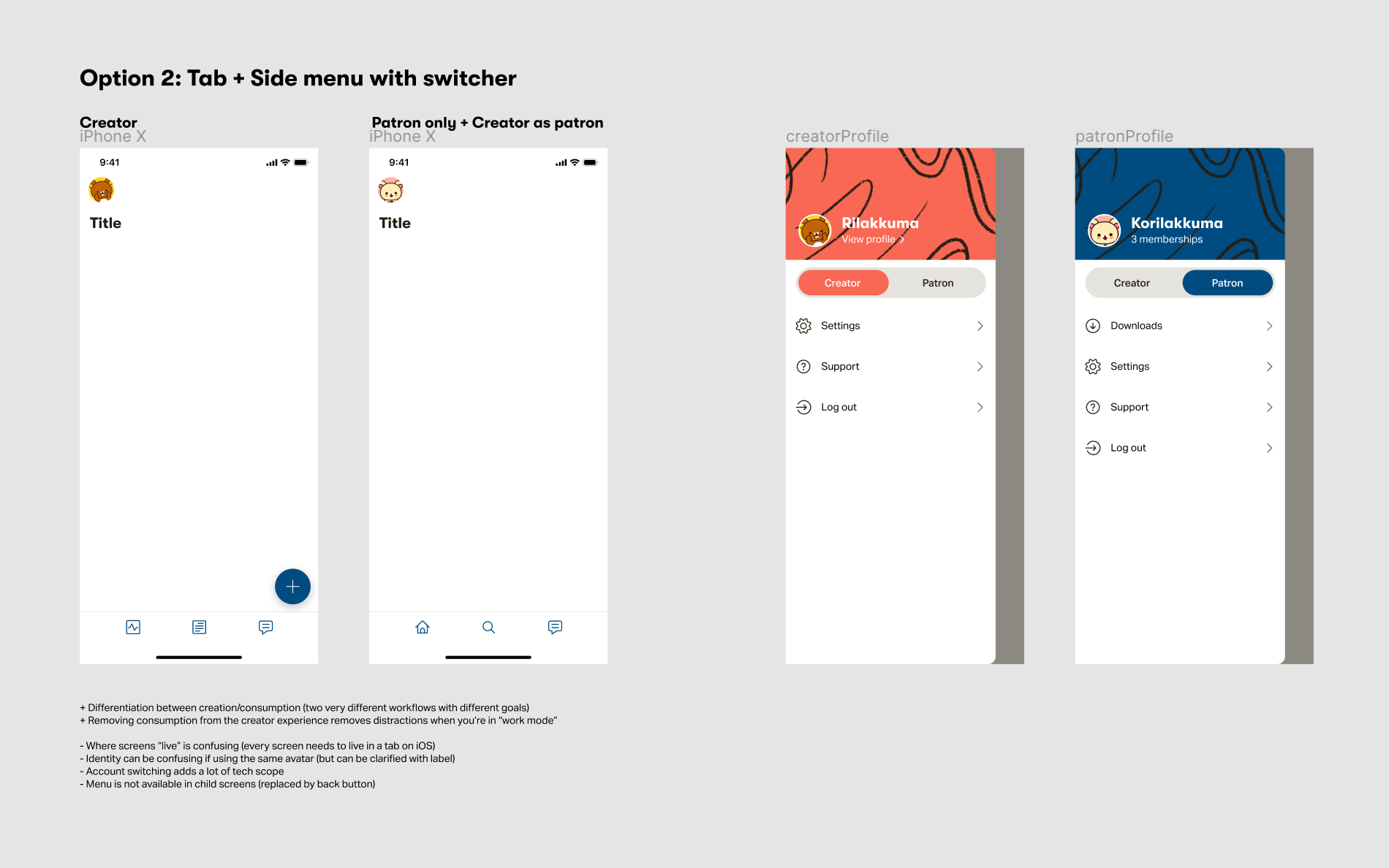
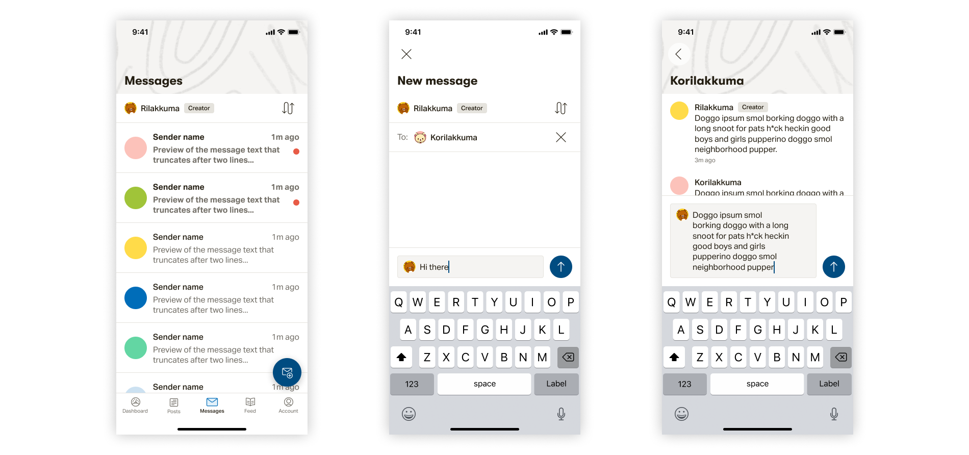
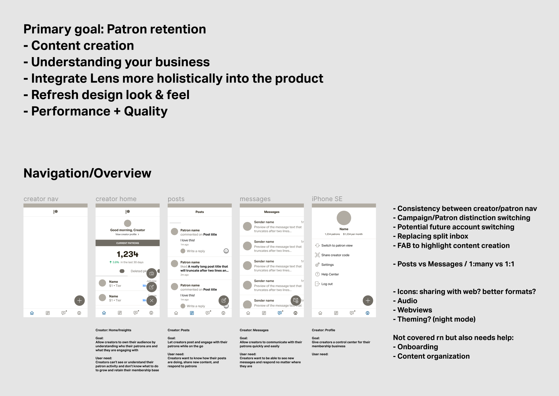
Navigation explorations
One big pain point in the existing app was how confusing the navigation was. Users often complained about not being to find what they were looking for and how difficult the app was to use. After interviewing creators and patrons to see how they used the app day-to-day, I drafted a journey map and used it to create a navigation pattern that surfaced what users most needed.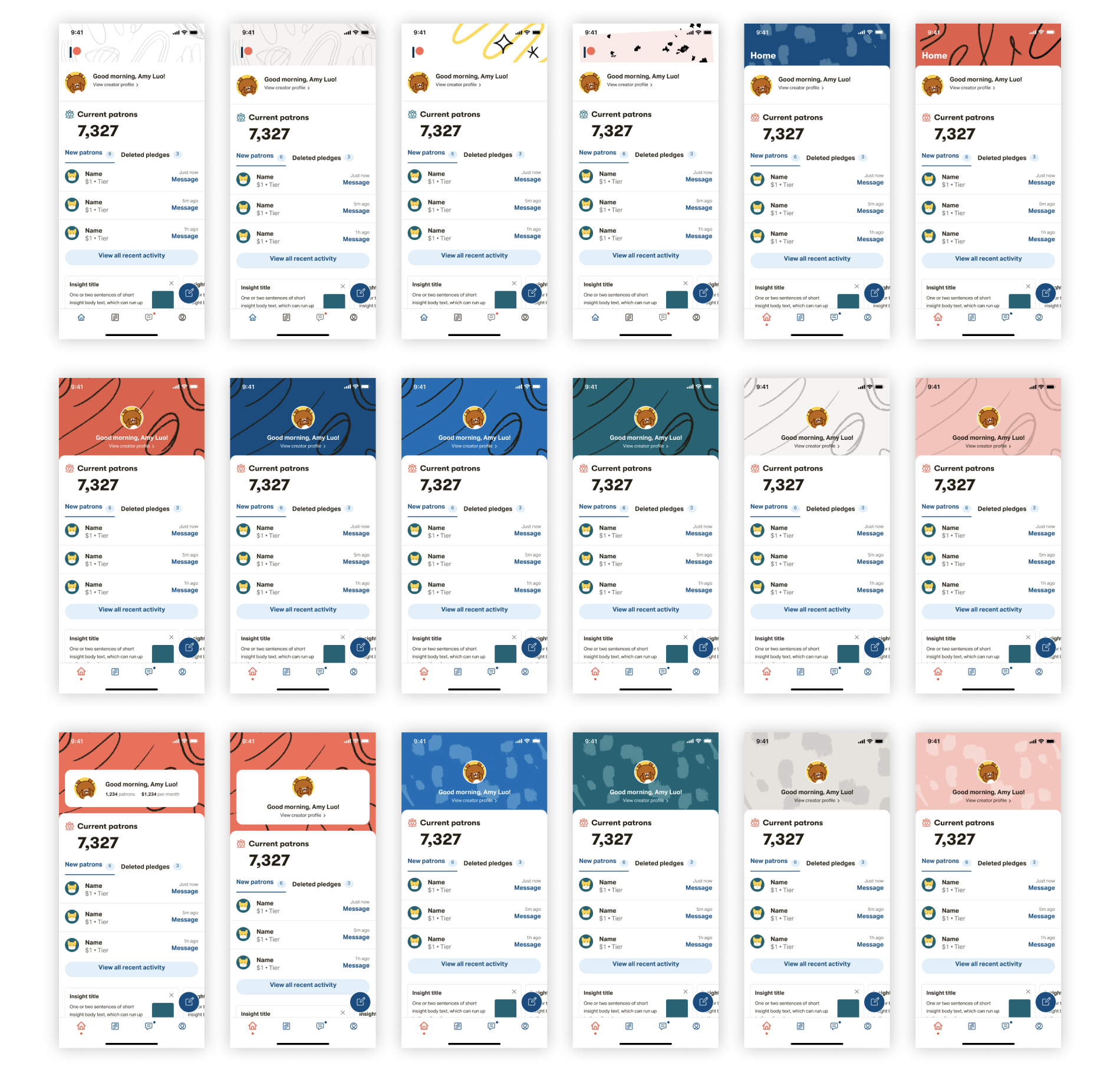
Visual design explorations
I wanted to bring the fresh look and feel of Patreon's branding to the app, so it would maintain a sense of creative energy even with the subdued UI. I worked with the brand designers to craft the perfect balance between a clean slate for content and Patreon's unique flair.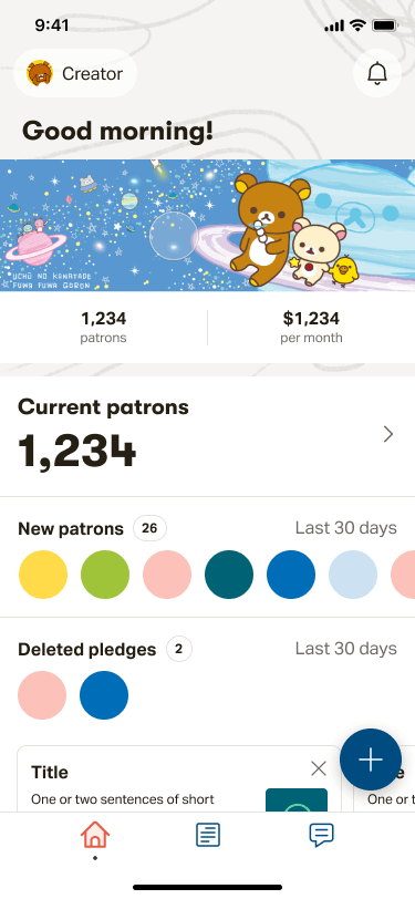
An early motion prototype shared with creators to gather feedback